POST
Review of WordPress Block Based Editor
Author: Billie Richardson
The new WordPress Block Based Editor makes working with widgets and layout much easier.
New WordPress Block Based Editor - Review
I recently returned to WordPress and began setting up a new site and blog using the Classic WP interface. After using WIX’s drag ’n’ drop method of entering and editing content, it wasn’t long before I found the WP Classic Editor, harder work and less easy to use. Simple functions like moving content within a post or including a thumbnail image, I found took several steps to complete and therefore, time consuming. And restructuring or editing a post was not straightforward, especially if it meant changing an image size or adding a table.
And then one day, I opened the WordPress Editor to add my latest blog post and up popped an invitation to use the new WordPress Blocks. It was described as ‘a new editor to make adding rich content to WordPress simple and enjoyable’. It also described the Blocks as ‘pieces of content… rather like Lego Blocks that you can move around and interact with’ and someone who loves Lego and who was experiencing difficulty resizing images for my blog posts, I decided to give WordPress Blocks a try.
What are WordPress Blocks?
Think of a block as place where you enter a piece of content. For example, in a new blog post or page, a piece of content could be a paragraph or an image. Each of these blocks of content can be edited and manipulated independently of other blocks. The Blocks are still referred to as paragraphs, images or tables etc - the taxonomy remains the same. But what is different is that by clicking or dragging your mouse, you can completely reorganise the structure of a post or page, quickly and without knowing how to code.
How to use WordPress Blocks

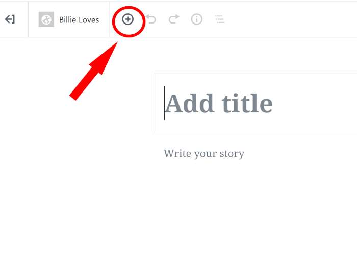
Each Block has its own settings and each page is made up of multiple Blocks. To open the list of Blocks begin by clicking on the + sign which can be found at the top of a new page/post or when you click on a page/post to begin entering content. You will be presented with a list of Blocks to choose:
- Paragraph
- Heading
- Subheading
- Quote
- Image
- Gallery
- Cover Image
- Video
- Audio
- Columns
- File
- Code
- List
- Button
- Embeds and more……
Click one of the Block Options and the item will appear on the page ready for you to use. For example by clicking on ‘paragraph’ a rectangle or Block will appear for you to fill with text. Once filled you can edit the text in the Block by changing the colour and size. When you’ve added several paragraphs there’s an option to easily swap their position on the page with other paragraphs or other Blocks. There are different features for each type of Block too and these appear when you click on a Block. By clicking and holding the six-dot-grid at the top-left corner of each block, you move blocks around the page.
What are the advantages of using WP Blocks?
Overview
-
I found using blocks very intuitive. I like the way Blocks turn a single document into a collection of elements that can be tweaked independently. The editing features for each Block is quickly accessed and means it takes just a few minutes to create pages of content with paragraphs of text interspersed with images, videos and different sized headings.
-
Blocks are less prone to various copy-and-paste issues, especially when copying content over from a Word doc or some other source.
-
The Block Editor provides a more consistent view of what your content Blocks look like in the editor and what it looks like to your readers.
-
There are lots of shortcuts that save time and each Block has its own settings revealed via the toolbar at the top of the Block.
-
Below I’ve added my thoughts on advantages for some Blocks I recently used:
Image Block
- Add images without setting up a media library.
- Add images directly to your post.
- Quickly create thumbnails by selecting one of the three auto-formatted sizes, thumbnail, medium or full.
- Click and drag images to create a gallery, in seconds.
- Replace/edit images in a couple of clicks.
- The Dimension setting allows you to set a custom Width and Height for your image/s.
- Add an image as a Cover Image for individual posts. You can overlay text and manipulate your images too.
- Create a gallery in seconds.
Audio and Video
Adding an audio/video clips is simple. Simply click and drag to any position on the page.
Spacers
A neat Block and one I like to use a lot. Add space between your blocks of content and decide how big or small you want the space to be.
Tables
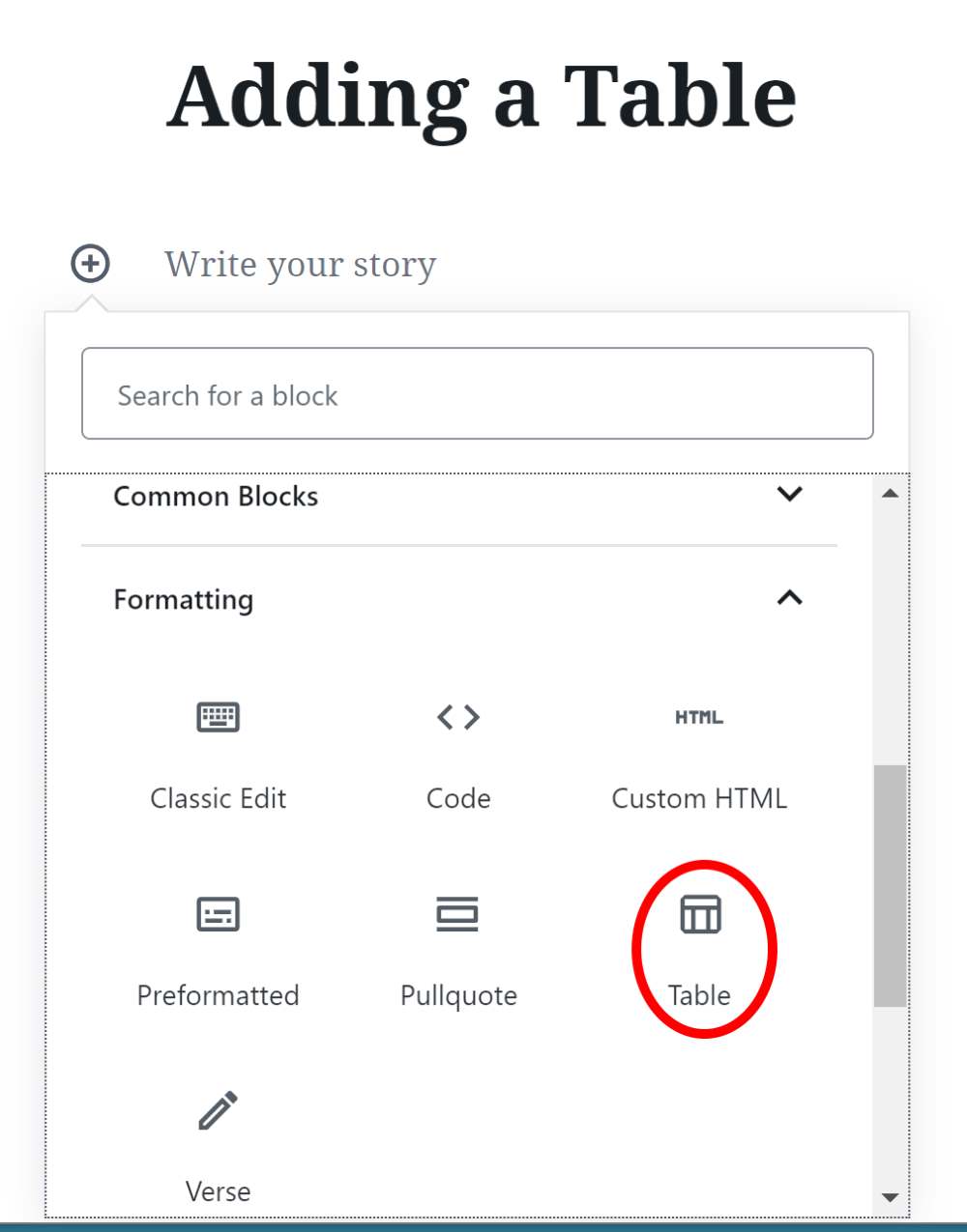
Decide how many columns and rows you want and where you want to position the table. You can add and remove columns and rows after the table is created too.

Widgets
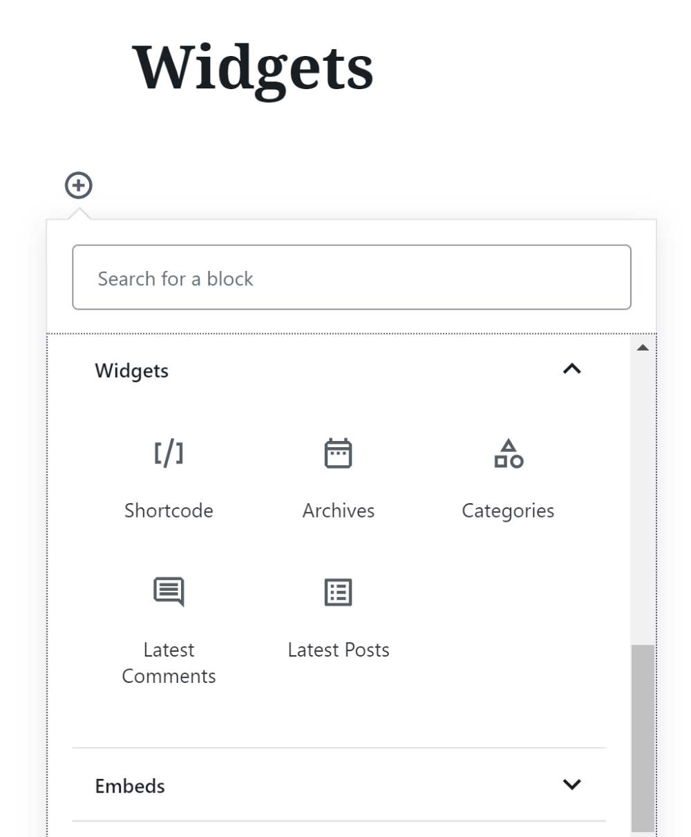
- Add a widget with links to posts by using the Latest Post block.
- Add a widget to link to post categories or to your site’s archives.
- Display a widget with the most recent comments in the Comments Block.

Button Block
A simple way to add a button for a call to action on your post or page.
Can you switch from WP Blocks to the Classic WP Editor?
You can leave the Blocks Editor at any time and return to using the Classic WP Editor by clicking the three dots at the top right hand corner of the editing screen and selecting Classic Editor.
And Finally……
-
The new WordPress Block Editor was released to me at a good time. As someone who doesn’t code, I found the new WP editor really simple to use and found it easy to arrange the content and layout of my pages.
-
The pages in the editor look more like the published content and I spend less time previewing content to check its look and feel before publishing.
-
The new Block Editor has also helped me to be more bold with my content and try new types of content to my pages. This is because I now spend spend less time formatting existing content and more time adding fresh content. Definitely a ’thumbs up’ from me!